Cairn Systems
Identity · Signage · Editorial
Complex systems. A clear structure.
- Facet symbol & wordmark
- Building signage
- Technical publication
- Information hierarchy
- Identity guidelines
Three parts, working together.
Cairn Systems needs an identity that can organise technical communication and remain recognisable in the physical environment. The direction brings a robust symbol together with an orderly information system.
Three angular facets increase in width as they descend. Their consistent cut and alignment make a single stable form. The name uses a direct, open wordmark, with SYSTEMS held beneath as a quieter descriptor.
A structure for longer information.
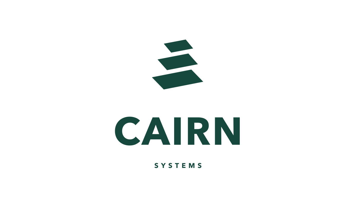
The complete signature.
The three facets share one angle and grow in measured steps. The gaps remain open so the symbol reads clearly at small sizes.
The defining colour of the identity.
A system that carries the idea.
The symbol provides recognition on equipment and signage. A modular layout then carries diagrams, project information and digital navigation. Deep green leads, pale green keeps reading areas open and copper identifies key information.
A coherent stack
The three facets share one angle and grow in measured steps. The gaps remain open so the symbol reads clearly at small sizes.
Hierarchy before decoration
A direct title, a small category and aligned supporting information provide the basic layout. Technical content has a clear place within the identity.
Colour that guides
Deep green carries the brand. Pale fields support reading; copper is reserved for emphasis rather than covering every surface.