Hollis & Reed
Identity · Stationery · Editorial
A considered way to inhabit a space.
- HR monogram & wordmark
- Studio stationery
- Project publication
- Material direction
- Identity guidelines
Two initials, with a shared structure.
An interiors identity that connects the discipline of architecture with the warmth of materials. Hollis & Reed needs a distinctive name and a compact mark for the quiet, tactile applications around a design practice.
The H and R share an upright. A measured horizontal joins the H, while the bowl and leg of the R keep their own clear outline. A spaced serif name softens the geometry without losing its precision.
A considered editorial introduction.
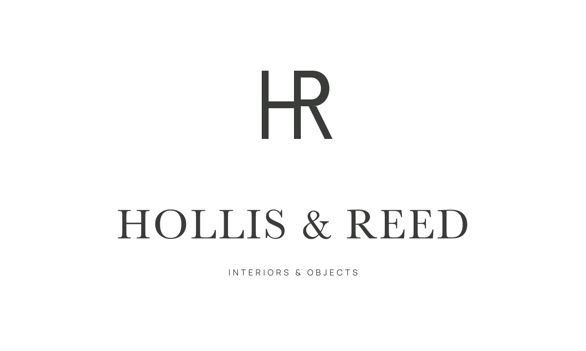
The complete signature.
The letters use one common stem, so the initials form a single mark. Open counters and controlled spacing keep each letter readable.
The defining colour of the identity.
A system that carries the idea.
The complete name introduces the practice. The monogram becomes a smaller material signature, while restrained typography orders the project information. Stone, warm paper and charcoal let the individual surfaces remain visible.
A shared upright
The letters use one common stem, so the initials form a single mark. Open counters and controlled spacing keep each letter readable.
A quieter introduction
The serif name sits apart from the denser monogram. Generous paper and a small descriptor make the hierarchy clear.
Material before decoration
A narrow palette connects the stationery and publications. Texture and careful production supply the detail.