
North & Form
Strategy · Identity · EditorialArchitecture
- Logo type
- Wordmark
- Applications
- Monograph & stationery
A clear structure. A bold point of view.
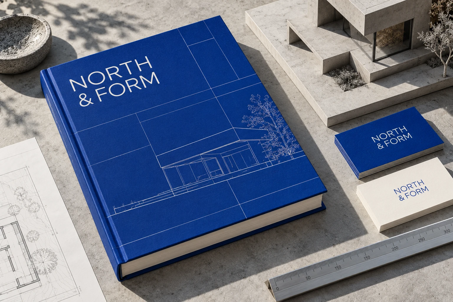
An architectural identity built around proportion, precision and perspective. North & Form pairs a rigorous typographic system with an unexpected flash of blue.
Architecture gives shape to an idea. This identity takes the same approach: a clear underlying grid, purposeful typography and a single confident colour. Every element has a role, from the compact wordmark to fine technical linework.
A closer look
Designed to hold together.
The grid becomes a shared language across books, presentation documents, stationery and digital layouts. Fine lines echo architectural drawings while the blue gives the whole system immediate recognition.
#153FBC#F5F4EE#A9AAA7
- Brand strategy
- Logo & visual identity
- Editorial design
- Stationery
- Presentation system
- Digital art direction