
Arcwell
Letterform logo · Print systemEngineering & manufacturing
- Logo type
- Letterform
- Applications
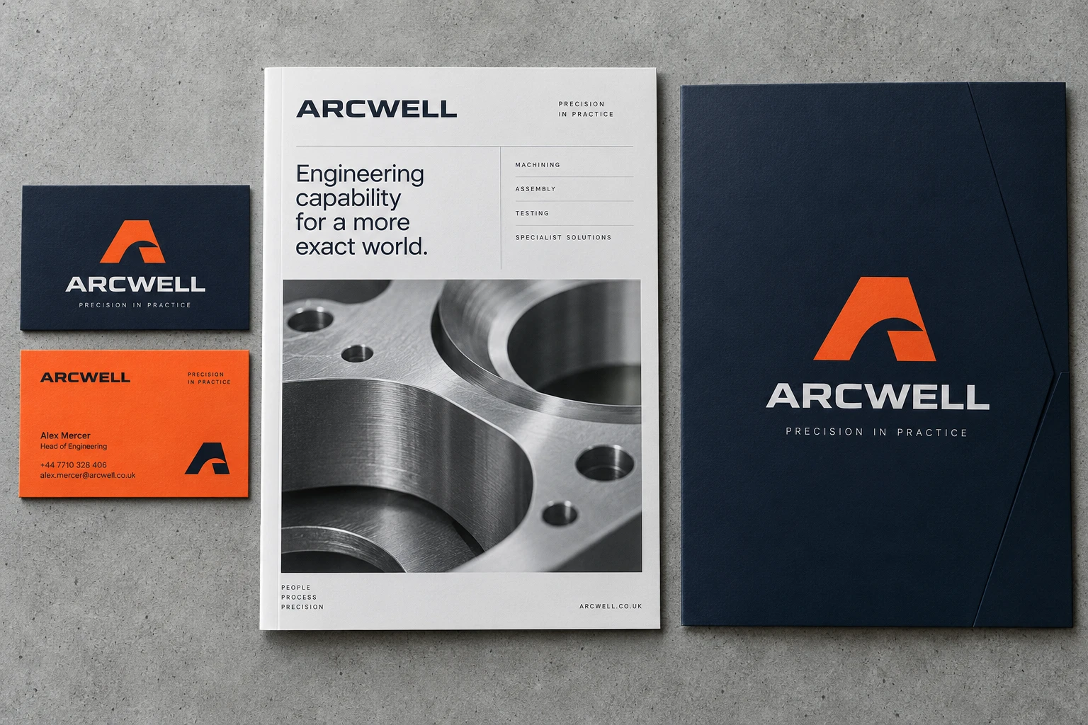
- A4 capabilities brochure, folder & business cards
Precision with a human point of view.
A compact letterform, a useful publication and a confident colour contrast. Arcwell puts a recognisable A at the centre of a practical identity for technical communication.
The mark uses a controlled cut-out to give a familiar letter its own silhouette. Orange identifies key information; navy carries the main identity. A technical brochure uses close-up photography to make the work tangible.
A closer look
Technical information, made approachable.
A repeatable grid connects technical information to the identity.
#E96024#142535#F0F0EB
- A letterform
- Wordmark
- Capabilities brochure
- Presentation folder
- Business cards