
Aurel
Brand identity · Packaging · BrochureFood & provenance
- Logo type
- Serif wordmark & emblem
- Applications
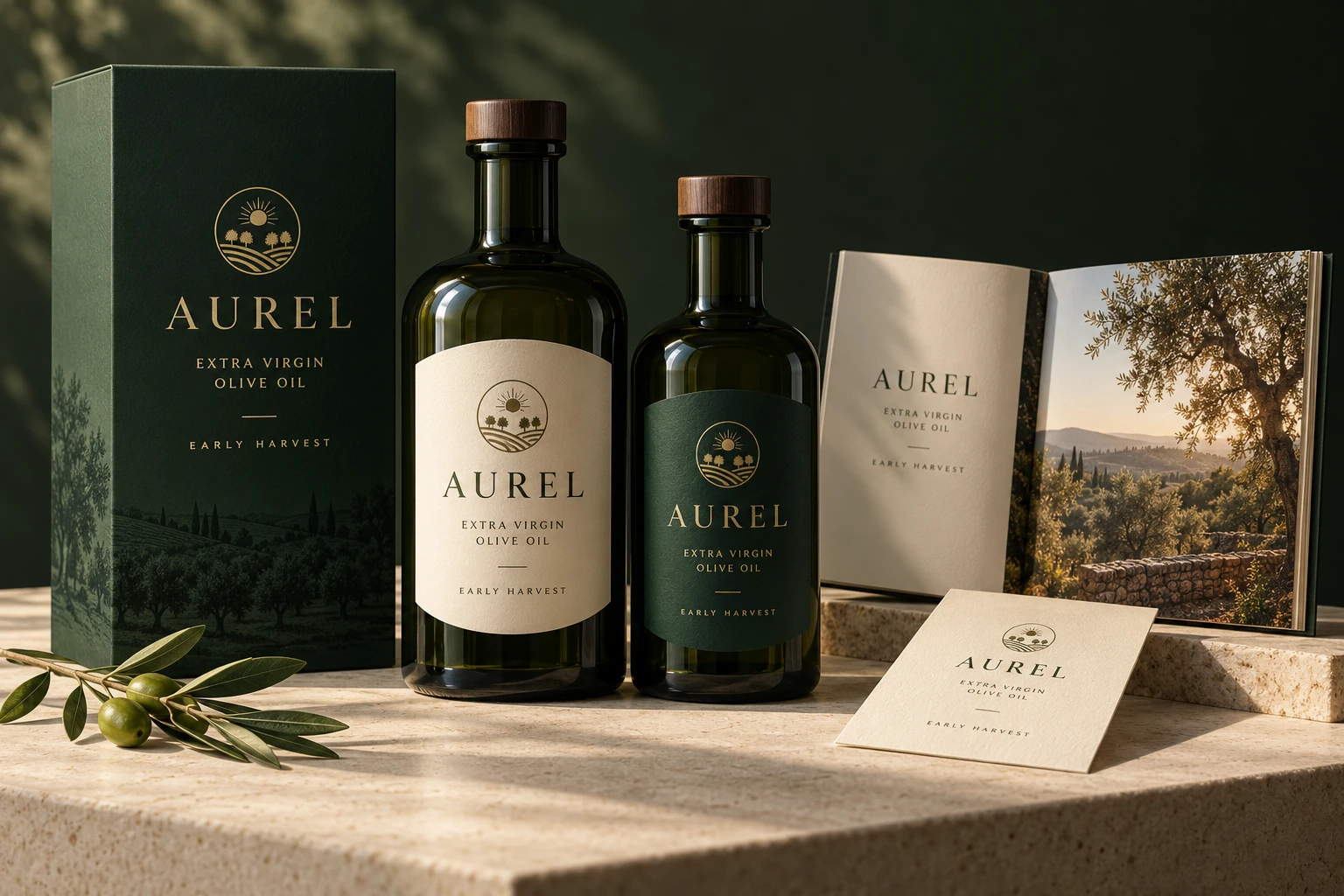
- Bottle labels, presentation sleeve & harvest booklet
A richer expression of origin.
An olive oil identity that brings the grove, the harvest and the product into one visual language. A sun-and-grove emblem gives the name a distinctive companion.
Deep green creates a strong frame for the warm label stock. The same elements move from the bottle to a presentation sleeve and harvest booklet, with photography carrying the longer story.
A closer look
The identity in use.
The emblem stays compact, the typography stays clear and the green carries the range. A quiet gold accent gives the darker expression definition.
#263B29#EEE5D1#BD9B55
- Wordmark
- Grove emblem
- Bottle labels
- Presentation sleeve
- Harvest booklet