Bramwell Hall
Identity · Hospitality · Print
A house with a welcome of its own.
- Window emblem & wordmark
- Entrance signage
- Guest stationery
- Room key
- Menu design
The house, reduced to three openings.
Bramwell Hall calls for a hospitality identity with character and clarity. The building provides the starting point, but the mark has to work on a discreet entrance sign and on the smaller things a guest handles during a stay.
Three arched windows form an architectural emblem, with a taller central opening and a shared baseline. The fine serif name brings a more leisurely reading pace. Plum and warm ivory carry the identity without resorting to a generic heritage crest.
A quieter welcome.
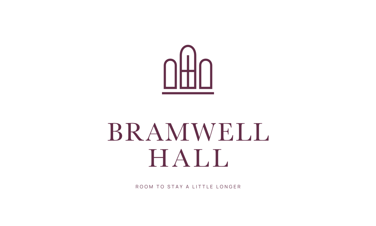
The complete signature.
The taller centre and lower side arches give the emblem its silhouette. Fine mullions provide detail without turning it into a miniature illustration.
The defining colour of the identity.
A system that carries the idea.
The complete signature introduces the house. The window emblem can then appear on a room key or menu detail. Print layouts use generous margins, clear service information and the same restrained hierarchy throughout.
An architectural shorthand
The taller centre and lower side arches give the emblem its silhouette. Fine mullions provide detail without turning it into a miniature illustration.
A considered welcome
The two-line serif name keeps the property legible and balanced. Warm paper gives menus and guest information a softer setting.
Scale to the encounter
An entrance sign needs recognition at a distance. A room key needs one small, clear mark. Each application uses the appropriate signature.