
Morrow
Visual identity · Catalogue · Business cardsFurniture & objects
- Logo type
- Wordmark & abstract letterform
- Applications
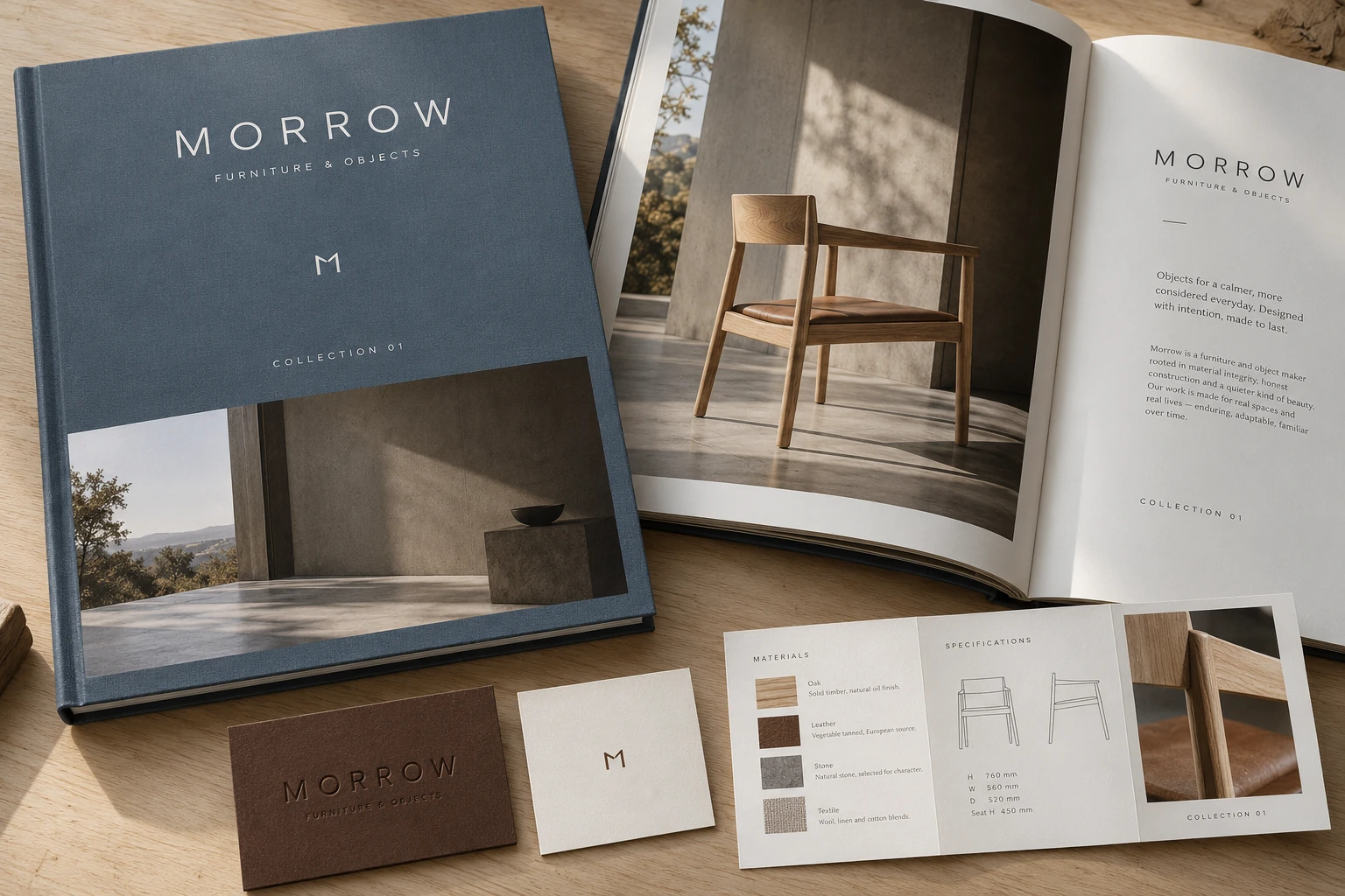
- Collection catalogue, specification foldout & business cards
Made to live with.
A furniture identity built around material, proportion and a calm editorial voice. A widely spaced wordmark and compact joinery-inspired mark sit within a slate, umber and warm-white system.
The catalogue gives product photography and construction details equal care. Quiet type, a consistent page structure and a useful materials foldout make the identity practical as well as recognisable.
A closer look
The identity in use.
Slate blue provides a quiet cover; warm umber gives the business card a different material expression. Shared type and proportion keep the pieces connected.
#687C88#EAE4D9#70513D
- Wordmark
- Joinery-inspired M
- Collection catalogue
- Specification foldout
- Business cards