
Still House
Naming · Identity · ExperienceHospitality
- Logo type
- Wordmark
- Applications
- Menus, stationery & guest touchpoints
Make room for a slower pace.
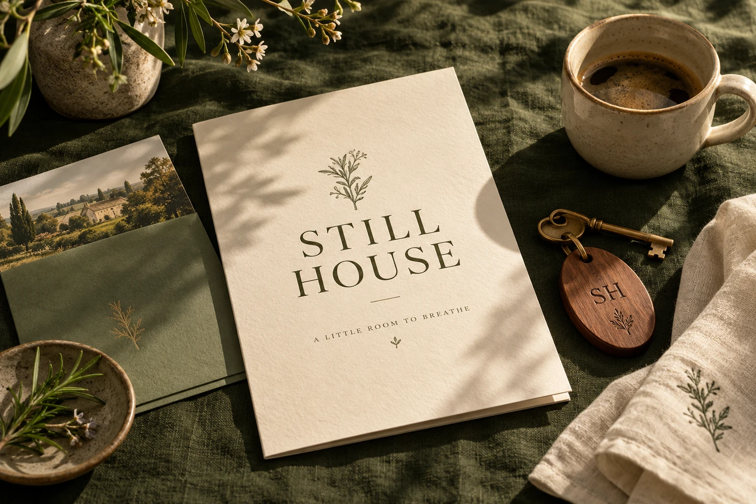
A hospitality identity rooted in small details. Still House combines an understated wordmark, natural textures and a botanical symbol to create a feeling of quiet welcome.
The name is a starting point for the whole identity. Stillness becomes generous space, a calm rhythm of type and a palette drawn from the landscape. A small botanical motif creates a personal signature across the guest experience.
A closer look
The details make the difference.
A room key. A menu. A note on the bedside table. Each touchpoint uses the same simple ingredients, with tactile materials bringing warmth and consistency to the experience.
#344B36#F3ECDC#A6AD91
- Naming
- Brand positioning
- Logo design
- Visual identity
- Menus & stationery
- Guest experience