
Velora
Positioning · Identity · PackagingBeauty & wellbeing
- Logo type
- Wordmark
- Applications
- Bottle labels & cartons
A quieter kind of confidence.
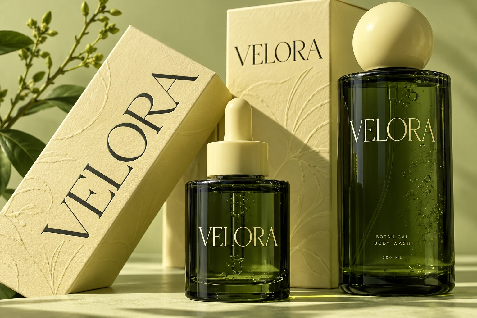
An identity for thoughtful daily care. Velora brings together botanical colour, sculptural packaging and a finely drawn wordmark to make a simple ritual feel considered.
The design starts with balance: an elegant serif wordmark set against bold, tactile forms. Forest green gives the range depth, while a pale botanical yellow adds warmth. The visual language avoids clutter so the products can speak clearly.
A closer look
Natural colour. Precise detail.
From a small bottle label to a full packaging range, the system makes room for useful information without losing its calm character. Generous spacing, restrained typography and tactile materials carry the identity.
#E4E59E#263C23#F4F0E5
- Brand positioning
- Name & tone of voice
- Logo design
- Visual identity
- Packaging system
- Art direction