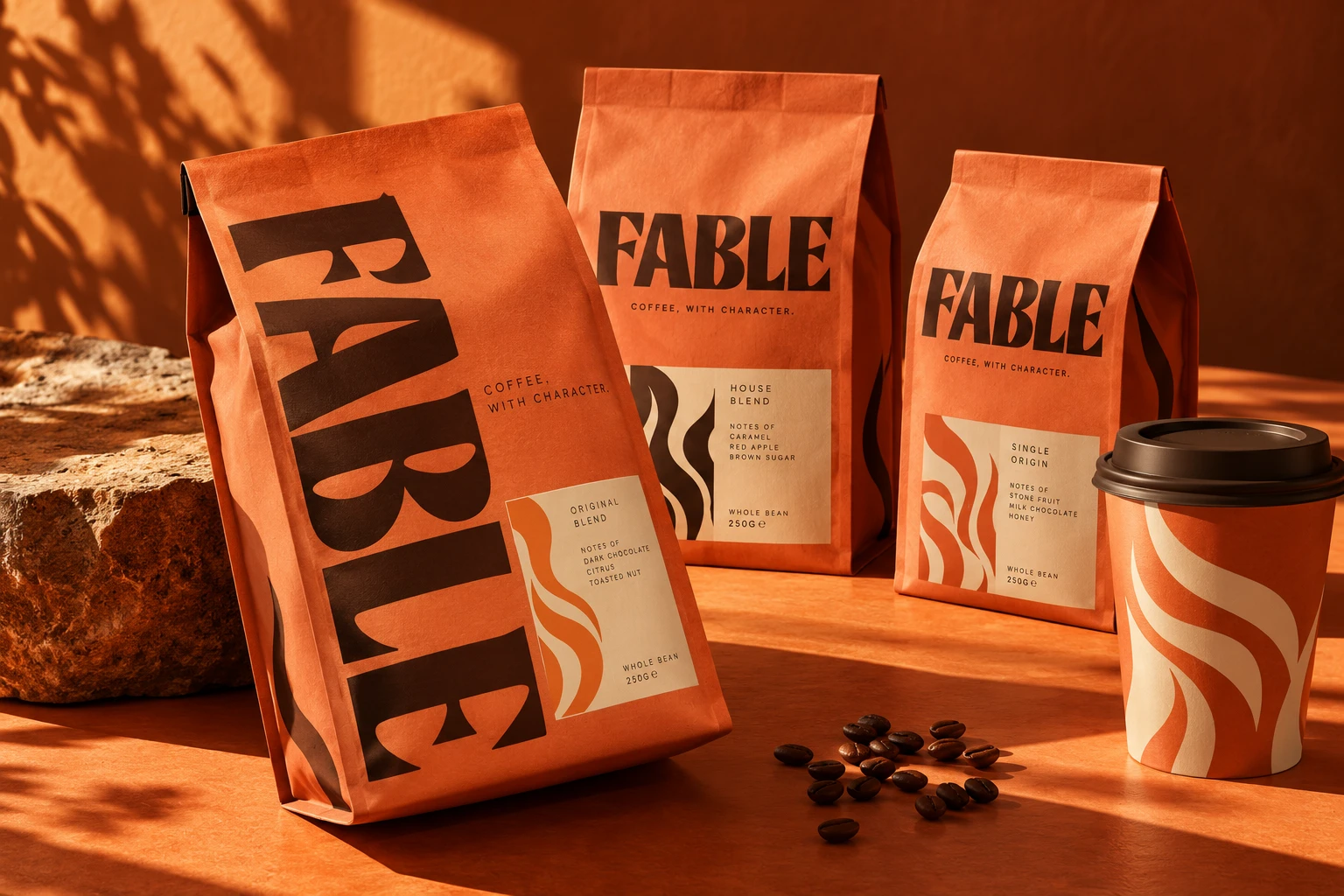
Wordmark
The name is the mark. Distinctive letterforms, spacing and proportion do the work. A useful choice when the name itself deserves to be remembered.
Fable Let’s talk
The right kind of logo depends on the name, the audience and where it has to work. These six approaches offer different starting points.
The name is the mark. Distinctive letterforms, spacing and proportion do the work. A useful choice when the name itself deserves to be remembered.
Fable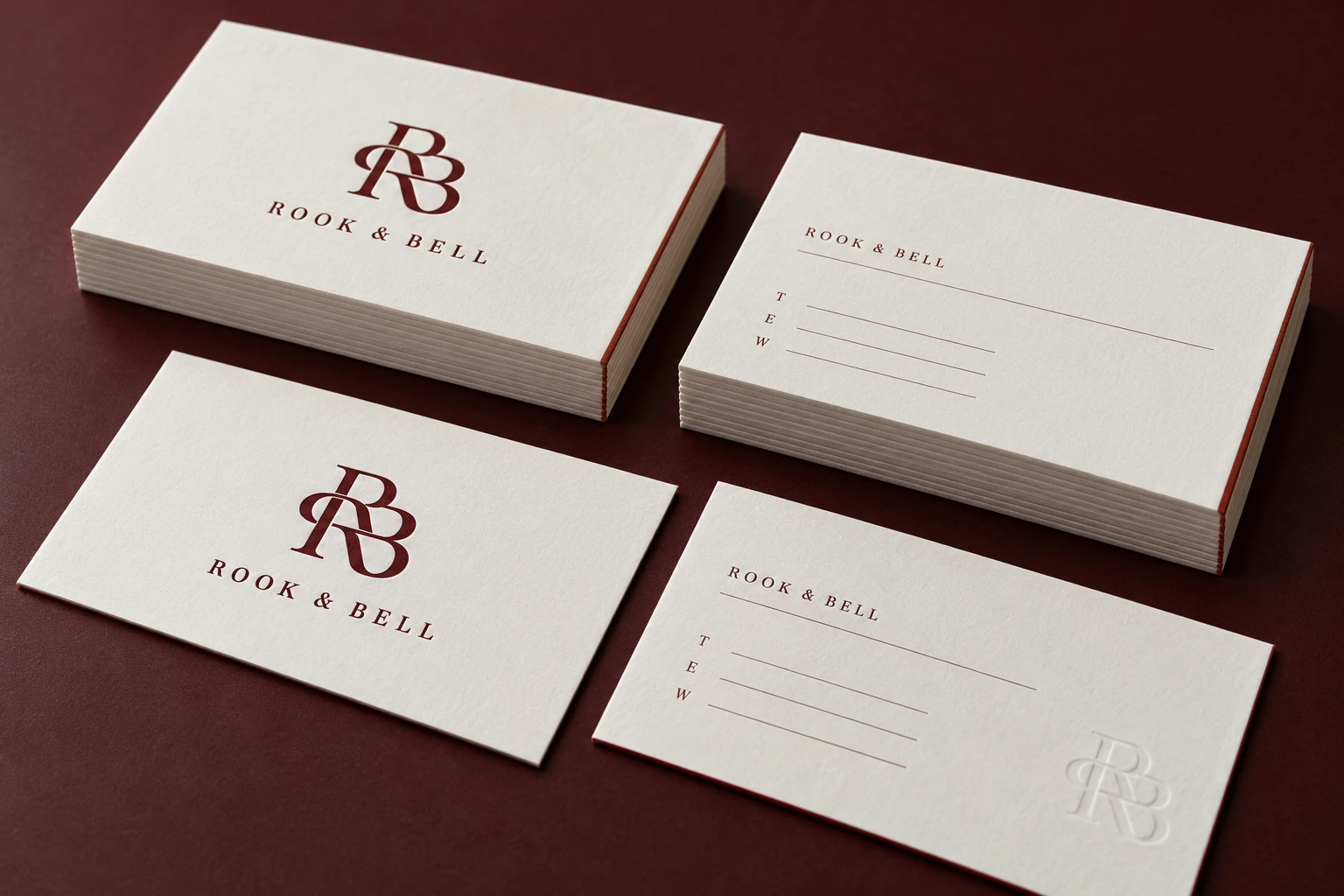
Initials combined into a recognisable signature. Particularly useful for a longer name or a brand that needs a compact secondary mark.
Rook & Bell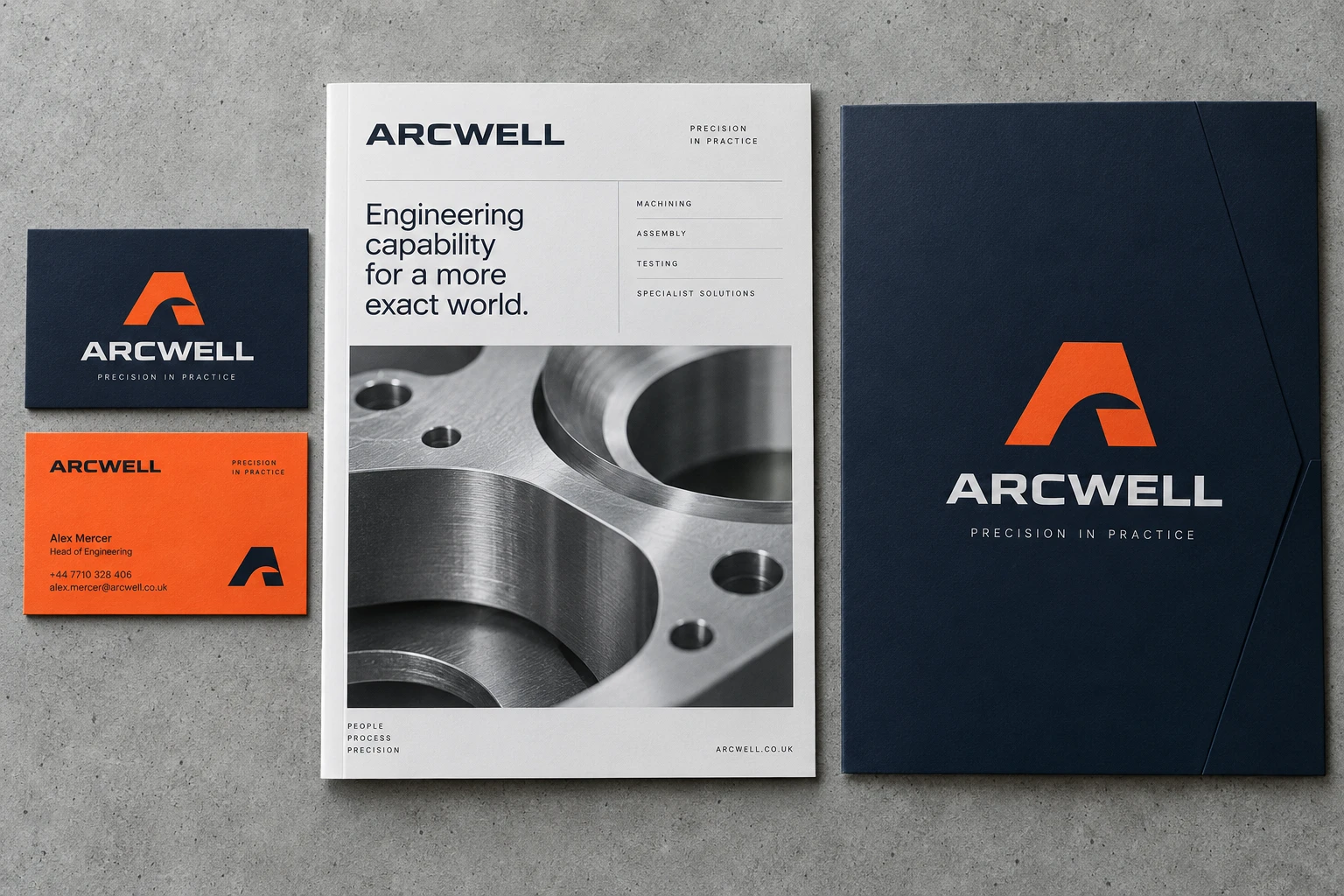
A single letter given its own construction and silhouette. It provides a simple shorthand for small formats, signage and digital use.
Arcwell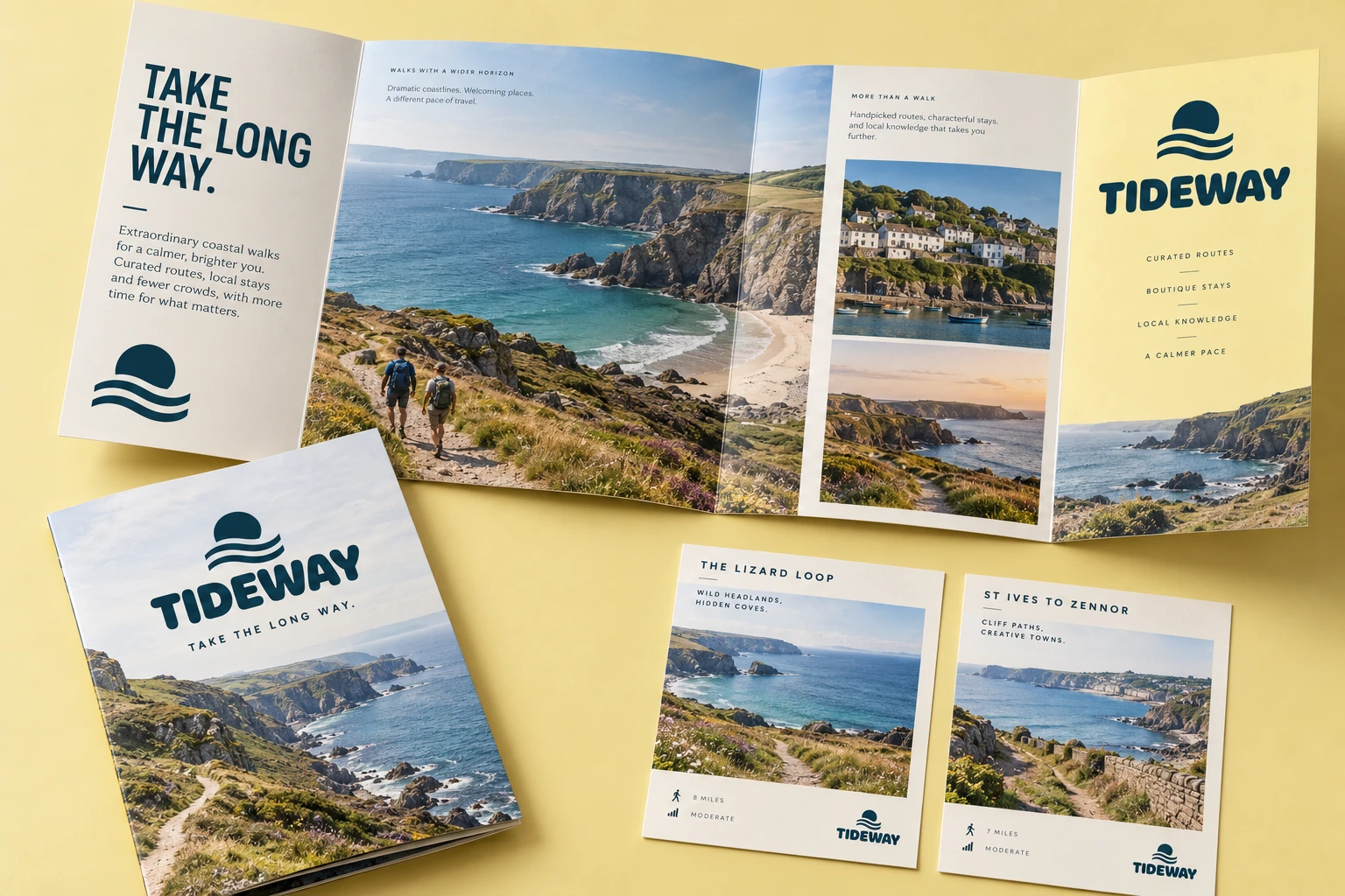
A recognisable object or image reduced to a clear symbol. The image should carry an idea that belongs to the brand.
Tideway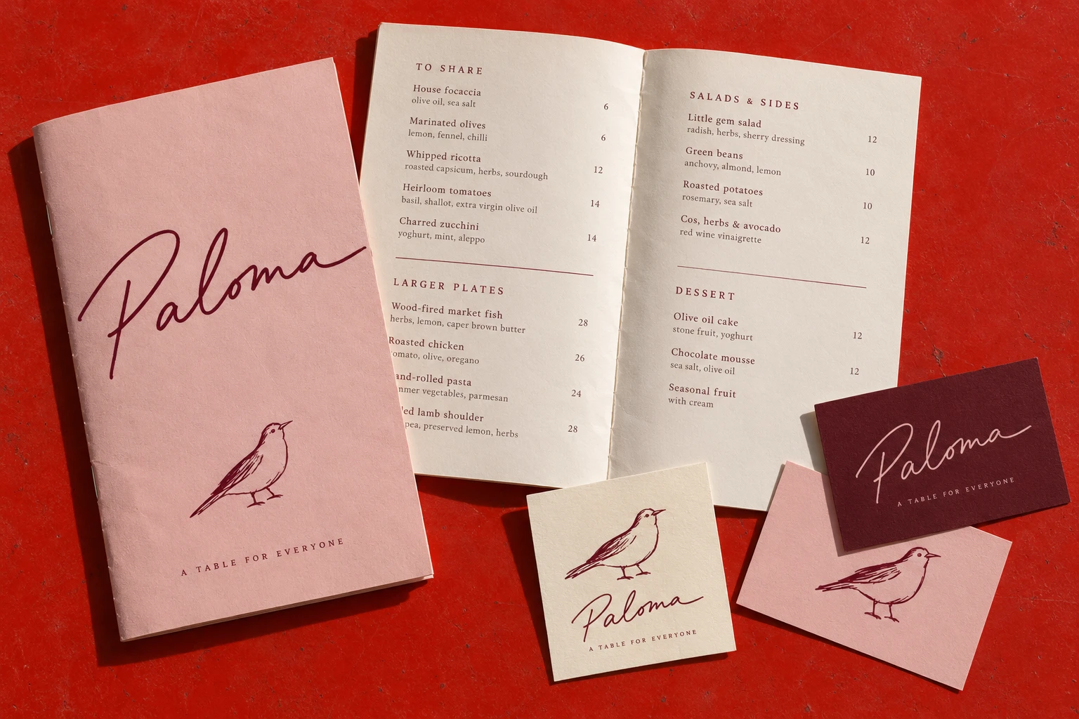
A name with the character of handwriting. The design needs its own rhythm while staying readable in practical applications.
Paloma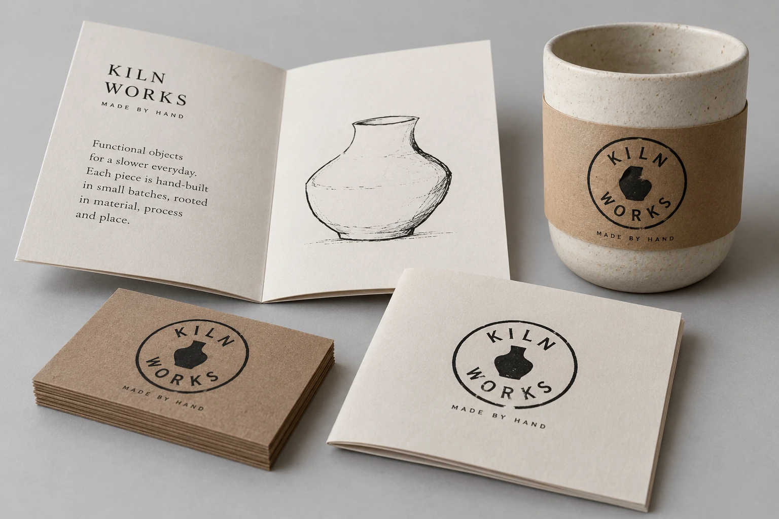
Name and symbol held within one shape. Well suited to a maker’s mark, product stamp, badge or compact printed signature.
Kiln WorksWhat matters is how well it fits the business. We look at recognition, readability, reproduction and the wider identity before choosing a direction.
Logo & brand identity